Sunday, June 10, 2012

JAXtutorial: DIY faux zinc

jar close2
Originally posted at DTTD imagine.design.create
Zinc is hot. I did a search for “zinc” on the Restoration Hardware website, and 232 matches popped up. With crazy-high prices. But never fear – you can create your very own faux zinc for a fraction of the cost of the real thing. And it’s really easy.
After reading a bunch of tutorials for varying methods, I decided to go with the easiest one, mainly because I already had the supplies I needed. {Check out my Crafty Stuff pinboard for lots of examples of faux zinc.}
Are you ready for one of the easiest faux techniques ever? OK, here we go…
You’ll need:
  • Black acrylic paint {I used FolkArt in Licorice}
  • Metallic paint in silver {I used DecorArt Elegant Finish Metallic Paint in Shimmering Silver}
  • Paint brush & pouncing brush
  • Clear paste wax & a rag
  • Something to paint :-)
This white ceramic jar was in one of the swag bags I picked up at IDS12 in January. The finish is rough & unfinished, which made it the perfect candidate to zinc-ify.
jar before
I totally forgot to take an in-progress shot, but it’s really simple – I just painted the jar black with my acrylic paint. When the paint was dry, I lightly rubbed on the silver paint with a pouncing brush.
image
After the silver coat dried, I rubbed on some clear paste wax, buffed it, and voila… faux zinc! It’s kind of hard to see the sheen in the picture, but it’s soft & subtle.
jar 2
I used the same technique on this plastic bird that I picked up at the Dollar Store.
bird before
I did the exact same thing, painting it black…
bird during
…and then rubbing on the silver metallic paint, followed by some wax and buffing.
bird after
I didn’t apply wax to the base – can you see that the finish on the jar and the bird is a bit softer than on the base of the bird?
pot and bird
I used the same technique on a white frame from HomeSense {the other frames are getting the chalk paint treatment}.
frames before
frames during
Here’s the completed faux zinc frame with paint chip art that I whipped up in a few minutes so I wouldn’t be showing you a naked frame ;-)
frame after 3
Rubbing the paste wax onto the frame wiped off some of the finish, so the frame is waxless. I just gently buffed it with the same rag I used to apply the wax to the other pieces to up the sheen factor just a bit.
The great thing about creating faux zinc is that you really can’t screw it up. If you put on too much silver paint, just go over it with more black paint and do it again. If rubbing on the wax rubs off the paint, add more paint {speaking from experience!}. Seeing as you want an imperfect/uneven finish, you don’t have to be precise – more black here and more silver there gives the effect that you want, so don’t worry about spreading the silver paint evenly. See the colour variations in this close-up?
frame close
And that’s really all there is to it! I’m going to try out a couple of other faux zinc techniques – I have a plan in mind to make over an oak coffee table that we have with old wood boards and the faux zinc technique.  The Brickmaker’s Table from Restoration Hardware is the inspiration:
RH table
For a detailed video tutorial of a different faux zinc technique, check out Jami’s night stand project over at Freckled Laundry. She did an amazing job!
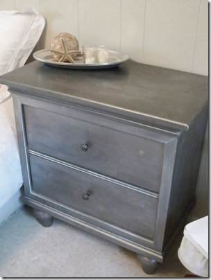
nightstand freckled laundry
Are you inspired to zinc-ify something in your house?
kelly sig
Linking up to…

Saturday, June 9, 2012

JAXtutorial: DIY maritime map letters

B
Originally posted at DTTD imagine.design.create and linked to the It’s a Cinch blog party.
The ladies at Thistlewood Farm, It All Started With Paint, Eclectically Vintage, The Cottage Market, and The Space Between are having another great blog party today called It’s a Cinch. The premise – do an easy-peasy project that you can finish quickly and with minimal effort.
I’m sure this project took way longer than it should have. But thanks to my {1} inability to focus on one thing for more than five minutes, {2} habit of making things 20 times more complicated than they need to be, and {3} an ingrained need for perfection, everything I do takes longer than it should. {Have I mentioned that I’m a little on the OCD side? Picture Sheldon on The Big Bang Theory with boobs. Yep, that’s me.} So overall, I probably spent a few hours creating creating my map letters {not including waiting time between a couple of steps}. But it was super-easy to do.
This is my It’s a Cinch project inspiration:
I had already bought white wood letters at Michaels for 50% off {I think they were around $3.50 each} I totally forgot to take a “before” picture of them – DOH! I bought the letters B E A C H. These are somebody else’s letters that look just like mine…
When I saw the PARIS map letters on Pinterest, I was like, YEAH, now I know what to do with the letters! So I searched the Net for some maps of beaches that I’ve been to. Originally I was going to do use a separate map for each letter, but then I came across this whopper map of the Maritimes:
Maritimes-Map
I like the soft colours and old look to the map. And after I printed it out on 16 sheets of 8-1/2” x 11” paper, I realized I could fit each letter onto an area of the map that I’ve been to – PEI, Cape Breton, and three other areas in Nova Scotia {including my beloved Lunenburg region}.
map with letters
Once I figured out where I wanted each letter to go, I cut each section from the original map image on my computer and printed each one out on its own sheet of paper. That way, I wouldn’t have to cut off the white borders and try to match up seams between sheets of paper.
B mapMap section for the letter B
Next, I traced around the letters and cut them out.
letters cut out
B map 2
I painted the sides of all the letters a light bluey-green. I realize now that I didn’t get any good pictures of the painted letters. DOH again! Anyway, after the paint dried, I used Mod Podge to attach each map letter  onto each wood letter. And voila, Maritime map letters!
BEACH
I used a little creative license with the A – I turned PEI about 70 degrees so I could fit more of of the island onto the letter.
A
And I made sure to fit my very favourite part of the Maritimes onto one of the letters – this is the Lunenburg region in Nova Scotia on the letter E:
E close
I still haven’t completely finished the letters – I don’t know if I want to seal them with Mod Podge or the spray sealer that I use on my paintings. And I have to decide where to hang them too.
And there you go, an easy-peasy It’s a Cinch project! If you want to create your own map art, there are some great ideas at Your Decorating Hotline. And check out Jason LaFerrera for a completely different & amazing take on map art.
Don’t forget to do the rounds at Thistlewood Farm, It All Started With Paint, Eclectically Vintage, The Cottage Market, and The Space Between to see more It’s a Cinch projects :-)


Also linking up to Nifty Thrifty Tuesday at Coastal Charm ‘cause these babies are definitely coastal! And pretty nifty too, if I do say so myself :-)
kelly sig

Friday, June 8, 2012

JAXtutorial: DIY gallery wall

Originally posted at DTTD imagine.design.create and linked to The Pinterest Challenge.
I’m so excited that I finally have a project that I can link to the latest installment of The Pinterest Challenge! The gallery wall that I revealed on Monday was inspired by not one, not two, but FIVE of my Pinterest pins. If that doesn’t qualify for the Pinterest Challenge, I don’t know what does! ;-) So I thought I’d combine my tutorial with this fun challenge and show you how to create a gallery wall, and how mine was inspired by images I pinned to Pinterest.
pinterest board 3 with numbers
1. Picture layout from Living La Vie 2. Picture layout from Martha Stewart 3. Layout template from ROOST Marissa Waddell Interiors 4. Homemade picture hanging tool from The Scrap Shoppe 5. Chelsea Gray wall colour from Restyling Home by Kelly

Before you start laying out your gallery wall, you need to choose your art. My wall is a collection of ocean-inspired photos, prints, shadowboxes, tile art, and a canvas. Using art that’s meaningful to you makes your gallery wall extra-special, so incorporate as many personal pieces as you can.
If you want all your frames to be the same, a great choice is the Ribba series from Ikea. They’re inexpensive, include the brackets and wire for hanging, and come in both regular frames and shadowbox frames. Combining the two depths of frames adds some dimension to your wall.
ribbas
1. & 2.  { Picture layout } Inspired by Living La Vie and Martha Stewart
inspire 1 inspire 2
Now that you’ve chosen your art, you need to decide on a layout. There are all sorts of gallery walls – symmetrical, asymmetrical, structured, random… check out my Gallery Wall board on Pinterest for some ideas. I combined elements from two of my favourite gallery walls to create my layout. I like the shape of the layout on the left (it reminds me of a wave), and I like the straight line between the two rows of pictures in the layout on the right.
Find a big empty space on the ugly pink carpet in your uber-messy basement and lay your artwork out on the floor. Move things around until you have a layout that makes you say “Woot! YES!”. Take a picture to refer back to – this is REALLY handy! Combining elements from the two inspiration layouts, I came up with this layout {still hadn’t decided on a picture for the big frame in the bottom row at this point}:
LOGO layout 2OMG, the mess in my basement is horrible! Oh well, nobody ever said the creative process was pretty ;-)
3.  { Layout template } Inspired by ROOST Marissa Waddell Interiors
template
Once you have a layout that you like, it’s time to make your layout template. Instead of wax paper, I used brown kraft paper from the Dollar Store. Decide how much space you want between your pictures – I chose 1-1/2”. Lay out your pictures on the kraft paper in the same order you had them on the floor. Use a ruler or measuring tape to measure the distance between each piece of art. My gallery wall has three rows, so I laid out my artwork one row at a time. If you’re creating a straight line, line the frames up right against the edge of the paper to make your life a bit easier :-) Then trace around each frame – easy-peasy!
LOGO lining up frames on paper
Tape your template onto your wall. Use painters tape so it’s easy to un-tape and move around. Some measuring and leveling are required here to ensure that your template is positioned correctly.
LOGO gallery paper layout
Now the fun starts! ;-)
4.  { Homemade hanging tool } Inspired by The Scrap Shoppe
hanging tool
Once you’ve attached the wire or other hanging mechanism to the back of each frame, it’s time to figure out where each nail or screw goes for each picture. A hanging tool makes this job a lot easier. Using the inspiration clothespin hanger as a guide, I made my hanging tool by hammering a small nail though one end of a stick of wood. I actually made two – one for smaller frames and one for bigger frames. You want both the head and the tip of the nail to protrude out from either side of the stick.
LOGO hangers
Hang a picture on the head of the nail on your hanging tool, and then hold the picture up against the correct position on the template.
LOGO line up frame with pencil line
When you have the picture lined up, push the top of picture against the wall. The tip of the nail will poke a small hole through the paper and into the wall. This is where the nail, screw, or hanger will go. {Hangers like the one in the picture below need to be positioned so that the bottom of the hanger is lined up with the small hole}
LOGO hammer nail into paper 2Can you believe all the frames are actually lined up properly with the edges of the paper!? I mean, see how easy it is to line up your frames perfectly when you use a template and a homemade hanging tool? :-)
Repeat for every picture. It takes some time and patience, but you can do it! I hung my pictures as I went along because I’m impatient and wanted instant gratification…
LOGO in progress
…so I had to take them down before the next step. Pull the paper off of the wall, and your nails & screws are all exactly where they need to be without any pencil marks on the wall.
LOGO screws paper removed
Now hang your pictures! I recommend starting at the bottom and working your way up the wall. Check your pictures with a level to make sure they’re straight.
LOGO level
And voila, gallery wall!
LOGO done 2a
But because I like to make my life difficult, I decided to paint the wall a darker colour so the white frames would really stand out. Or maybe I did it because I just really like painting ;-)
5. Chelsea Gray wall colour
Inspired by Restyling Home by Kelly

After agonizing over the right shade of gray, I finally decided on Benjamin Moore Chelsea Gray in the ulti-matte finish after I saw this bedroom painted Chelsea Gray.
inapiration colour[11]
It hurt to pay $60 for a gallon of paint – when did BM paint prices get up into the Farrow & Ball range? But a quart wouldn’t have been enough. Sometimes you gotta do what you gotta do. And yes, I just painted right over the screws and nails {I taped over them first}.
chelsea gray logo
And NOW the gallery wall is officially finished!
LOGO gallery done 1
LOGO gallery done 2
Thanks to everyone who inspired my gallery wall project. And thanks to the hosts of The Pinterest Challenge:

Be sure to stop by their blogs to see their projects, to link up your own Pinterest Challenge project, and to see what everyone else has linked up.
Erin at The Great Indoors { Mason jar chandelier } Katie at Bower Power { watercolour jellyfish art }
Sherry at Young House Love { homemade beanbag } Cassie at Hi Sugarplum! { DIY faux antlers }
If you’ve been thinking about creating a gallery wall in your house, I hope you’ll find my tutorial helpful. And when your wall is done, please let me know, I’d love to see it :-)
If you want to see more of what inspires me, click here to check out my boards on Pinterest.
kelly sig